Medical Case Studies
Nature Art for Regional Hospital, Pomona, CA
- Regional Medical Center
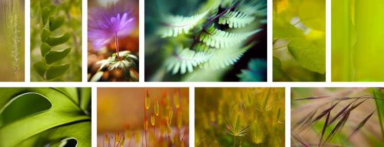
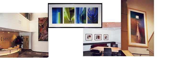
- Large scale nature photography printed on art grade aluminum
- No wood is used in the framing, mounting, hanging or printing of the artwork.
- The placement is on the main floor of the Radiology and Lab Corridors
- 1.25"D black metal recessed frame on the back of each piece gives a clean elegant stand off from the wall
- Unique security hardware aids in the quick installation of the deep stand-off frame
- 40,000 square feet area of art
BRIEF: The hospital is a not-for-profit, regional Medical Center dedicated to providing high quality, cost effective health care services to residents of the greater Pomona Valley. The Medical Center offers a full range of services from local primary acute care to highly specialized regional services. Basic to the mission is a commitment to continuously strive to improve the status of health by reaching out and serving the needs of a diverse ethnic, religious and cultural community. The Medical Center provides the surrounding community with access to state-of-the-art technology, access to valuable wellness education programs and plays an active role in helping individuals maintain a healthy lifestyle.
PLAN: The art reflects the natural environment. Large scale nature photography is printed on an art grade aluminum substrate. No wood is used in the framing, mounting, hanging or printing of the artwork.
The placement is in the main floor of the Radiology and Lab Corridors. The hallways are long and the art helps to provide a pleasing distraction and a healthy perception of nature as people walk or are taken to their destinations. The ceilings are low so the art creates an expansive feel.
PROCESS: FAM provided a custom menu of art design services including, the art selections presented digitally, complemented by a presentation of original fine art to support the objective. Professional project management services included that commissions and framing be produced to exact specifications and meet the desired completion date. The receipt of shipments, installation supervision and professional security installation were overseen by a FAM team member.
ARTWORK:
- All original fine art photography of nature subjects printed on an art grade aluminum substrate. Aluminum box frames on the back of each piece gives 1.25"D offset from the wall. No wood is used. Directions for easy anti-bacterial upkeep of the art is provided. Artwork is security installed with unique hardware that aids in the quick installation of a deep stand-off frame.
- 6 artists and 3 publishers provided FAM with high res files sized to print. Artwork is all original fine art photography and not mass-produced. It has a sophisticated feel and shows that care and time was taken in picking the art so that the visitors and patients feel that they are cared for, well taken care of and have peaceful, visual inspirational places to go.
OUTCOME:
- The Art reflects the local area, provides a soothing atmosphere and has no wood to meet the client’s objective.
- Clean, sophisticated presentation without framing has a modern appeal.
- The client is very happy with their finished interior.
Original Photographs of Iconic Locations and Nature Art for Regional Medical Center, Valencia, CA
- Artwork for Outpatient Wound Care Services
- Employs Beautiful Photographs of Major Cities and Public Lands in Exam Rooms as Conversation Starters for Patients with Many Repeat Visits
- Nature Imagery Soothes Patients in Waiting, Reception, Corridors and Doctors' Office
- 4,225 square feet
BRIEF: Inside a plexiglass tube filled with pressurized oxygen, patients rest on a bed, talk on the phone, watch a movie, sleep or are soothed by art while they heal, chronic wounds in 90-minute increments. This is using hyperbaric oxygen therapy, now to be introduced to local patients, five days a week.
'Hyperbaric Oxygen Therapy (HBOT) is a therapy that enhances the body's natural healing process by putting the patient in an enclosed environment in which he or she inhales 100% oxygen. The result is that the amount of oxygen in the patient's blood is increased, which in turn restores the normal levels of blood gases and tissue function to promote healing and fight infection. It is an effective therapy that is used to supplement other advanced wound care treatments. Used for several decades, hyperbaric oxygen therapy allows patients to heal in 20 to 30 sessions as they breathe 100 percent oxygen.'
PLAN: Art needs to reflect iconic locations ranging from destination cities to national parks in exam rooms with soothing nature images in reception, waiting, corridors and doctor's office. These iconic locations will serve as conversation starters as patient, visit these locations in exam rooms, with doctors and nurses during their many repeat visits.
PROCESS: FAM lead a brief scoping meeting to uncover the needs of the various stakeholders, provided an exciting selection of art options presented digitally, complemented by a presentation of original fine art to support the objective. Professional art services included, locating the art on the client's floor plan, scaling the artwork per location for variety and a customized look and meet the quick turn-around time. Project management services included professional security installation and installation supervision.
ARTWORK:
- Direct print to a specialized aluminum substrate made for fine art printing.
- A durable finish, not requiring glass or wood.
- Easy to dust or clean with mild soap and water or a water and bleach solution.
- Framing without wood or glass included a 1.25"D black matte metal, recessed back frame.
- A clean, direct, contemporary look for a newly designed interior, providing a lovely complement to reception, waiting, exam rooms, doctor's office and corridors.
- Selection of high resolution files that will print with a sharp focus for the desired output sizes.
- The creation of ready to print files for production.
- Specialized security hardware for quick installation of the deep recessed frame.
- A security installation technique that is made, to be easily removed and rehung by the client if needed.
OUTCOME:
Beautiful display of color, light and atmosphere for soothing and inspiring repeat visits.
TESTIMONIAL:
"Great, love it, it’s beautiful! My favorites are the poppy fields." - Director of Outpatient Programs
Art at Children’s Hearing Center, Los Angeles, CA
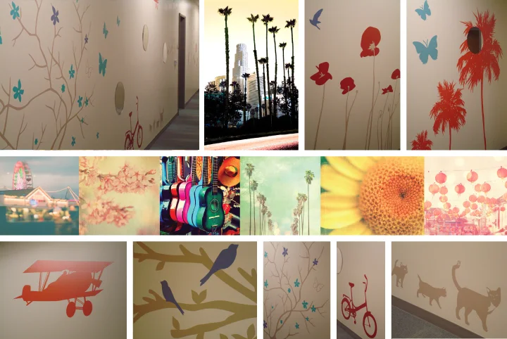
- A storytelling decal art mural of animals, palm trees, birds, butterflies, vintage bikes and planes
- Nature photography with a vintage filtered effect
- Imagery with Los Angeles iconography
- Art for many audiences
- 25,000 square feet area of art
BRIEF: The Center for Childhood Communication provides audiology and speech language pathology services to children with hearing loss from birth to adulthood. Its mission is to help children with hearing loss achieve developmental, academic and social outcomes that are commensurate with their hearing peers. The audience includes children, their parents and relatives, doctors, therapists, staff, and board of trustees.
PLAN: The artwork needs to have a Los Angeles theme; have a vintage feel in acknowledgment of the surrounding buildings; have a contemporary feel in acknowledgment of the cutting edge work being achieved at this facility; as well as be interesting to children; have a sophisticated look and feel for other audiences such as donors and staff and use the institution’s color palette to brand.
PROCESS: Art design services included a custom menu of art selections presented digitally and complemented by a presentation of original art to support the Client’s objectives. Professional Project Management services included commissioning art and framing to be produced to exact specifications as well as meet the desired completion date; receipt of shipments and coordination of receipt of art; supervision of decal mural installation and security installation of framed art.
ARTWORK:
- Nature photography with a vintage effect is placed in the staff offices that are visited by patients and their families as well as in interior corridors.
- A storytelling decal art mural of animals, palm trees, birds, butterflies, vintage bikes and planes is incorporated on the walls of the main corridors.
- The artwork is playful for a child’s imagination but also engaging for adults.
- Mirrors strategically placed at various heights allow children and adults to stop and consider their reflection among the three main corridors of decal art murals.
OUTCOME:
- The two artists who were chosen for the vintage effect photography inspire a unique approach to Los Angeles iconography.
- The colors chosen for the decal art murals in the 3 main corridors share the same color palette as the entrance Reception/Waiting Area continuing the color palette throughout the facility.
- The artwork offers a unique approach to ‘What’s on your Walls?’ a Fine Art Matter’s slogan.
- The artwork is unique, engaging and meets the needs of its varied audiences.
Art at High End Medical Satellite Clinic, Beverly Hills, CA
- Art for patients who are trustees, donors and big supporters of the local, name sake institution
- Audience will have many appointments
- Art needs to be high quality, welcoming and have Hollywood glamour as well as branding in support of this prominent institution
- Penthouse elevator lobby opens onto the 24 seat boardroom and the adjacent conference room with views of the Hollywood Hills, the Hollywood Sign and a built Zen Garden
- 13,000 Square Feet
- Interior Architecture: RTKL Associates - Miami; Principal: Gina Goodin
BRIEF: Patients are trustees, donors and big supporters of the local, name sake institution. This is a prominent institution with an international reputation. 90% of the patients are world renowned and will have many appointments. The target audience is supporters, donors, trustees, distinguished, sophisticated glitterati not necessarily traditional.
PLAN: The art needs to be high quality, welcoming and have Hollywood glamour as well as branding in support of this prominent institution. The penthouse elevator lobby opens onto the 24 seat boardroom and the adjacent conference room taking in views of the Hollywood Hills, the Hollywood Sign and a built Zen Garden. This area will be used by trustees and active donors, for the purpose of entertaining and fundraising, accommodating 40-50 guests.
The clinic space needs to be calming, soothing and beautiful. The interior space needs to make the patients feel that they made a good decision to come here; send a message that the staff is established with integrity, the best in field with a high level of care and skill.
PROCESS: FAM's design services included a custom menu of art selections presented digitally on a 32” screen as well as a presentation of original fine art, sample art to meet the end result, specific artwork presented directly by artists and some art viewed conceptually in location. Professional project management services included that the criteria issued for commissions and framing were scheduled to produce exact specifications and to meet the desired completion date; the receipt of shipments; insurance certificates; loading dock coordination; installation supervision and professional security installation.
ARTWORK:
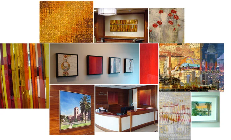
- The artwork is original, modern, elegant, confident, and accessible with a rich layering of unique and varied materials.
- The mediums used include a pair of resin mixed media wall sculpture of equal size but on opposite slant panels; color infused wax paintings in rich red, white and grays; paintings of 5-8 layers of cooked and carved gesso and marble dust; mosaic resin work; a hand cut mosaic glass and mirror wall sculpture; cut silk tapestry; a branded palette knife oil painting, mixed media geographically specific work on canvas; geographically specific hand colored photographs; original works on paper and canvas.
- Abstract and representational imagery includes artwork by local and national artists, all artistically framed to enhance the art and the environment.
OUTCOME:
- Custom selections and commissioned art pieces complement and contrast with existing architectural features.
- The artwork is unique and high quality to reflect the company's high level of care beyond its peers, best in the field.
- The colors are warm and richly saturated and create a soothing, beautiful atmosphere.
Art for Veterans Mental Health Initiative, Fifteen Buildings in Southern CA
- Fifteen Buildings with Seventeen Directors
- One Thousand Pieces of Framed Art
- Art selected to address the unique patient population of each building and the Directors' message
- Transcend the joy of art into the Veteran's lives and the health care workers who support the Veteran's progress
- Treat each of the fifteen projects as a seamless whole, from the Discovery Phase to Delivery and Security Installation
BRIEF: We were provided with the contact information of seventeen directors who were specified for the Mental Health Initiative. The contact information corresponded with fifteen Mental Health facilities which were located within a 175 mile radius from West Los Angeles, California. The buildings ranged in size from clinics to two floor facilities.
PLAN: Set up Creative Discovery meetings with each Director to reveal their objective and to plan out the most appropriate approach. Treat each of the fifteen projects as a seamless whole, from the Discovery Phase to Concept to Presentation to Production to Delivery and Security Installation.
PROCESS: With the information from the Creative Discovery Phase we designed several types of Presentation Portfolio's - a folio of the designed space that melds our creative design approach to the need of the patient population. The Presentation styling varied from In-Person Digital Presentation Portfolios, Email Presentation Portfolios and Presentation Portfolios each beautifully displayed with practical solutions to inspire and to support the careful planning of each space.
OUTCOME: Works of art were carefully selected to positively delineate the way different areas of the building were being used and to address the unique patient population of each building. We transformed the corridors with beautifully framed art. We were able to transcend the joy of art into the Veteran's lives and the health care workers who support the Veteran's progress. We added color, texture and a little bit of something for everyone. We accessed our professional design skills in locating the art, making sure that the scale of the art was appropriate for each location. We achieved a flow from one type of imagery to another. The art was located so that it would get the most impact. We made sure to add impact by selecting matting and framing that would unify the space. We ensured a joyful, successful and satisfying outcome by using our design and fine art expertise to create a professionally designed environment. We made the selections, customized and purchased all of the fine art to support the message.
*Note: each project had an objective based on the type of patient, the patient need and imagery was selected to "effect" change and to meet the need of each patient population. The inspiration was provided to us by each of the directors for their specific use of the space and their objectives.
Ultimately, the artwork welcomes, adds inspiration and value while it supports the varied needs and the Director's message. The artwork continues to support the Veterans and the employees while they do their important work.
Art at Outpatient Ambulatory Care Center, Sepulveda, CA
- Replacement facility on fast track
- Tailor specific artwork to themes, patient needs, facility attributes and project goals
- Select art work to coordinate with the color schemes of four pods and patient needs
- 271,000 Square Feet
BRIEF: Tailor specific artwork to themes, patient needs, facility attributes and project goals.
PLAN: Select art work, themes to coordinate with the color schemes and patient uses of four pods.
PROCESS: Selected and prepared (acquired, commissioned, framed, matted, and glazed). Installation was addressed with attention to the specific requirements of the Department of Veterans Affairs as it relates to patient safety, durability and maintenance.
“I would like to commend you on the unique artwork and customized framing that you provided for Building 200, our new Outpatient/Ambulatory Care Center. The nearly 300 pieces of framed artwork welcomes our audience, and ties together all elements that went into the project.”— Chief, Environmental Management Department, VA Greater Los Angeles Healthcare System
Art for Veteran Affairs Greater Los Angeles Healthcare, Westwood, CA
- Dramatic large scale paintings that inspire through scale, story telling, location and style
- Encourage patients to eat healthy and feel respected, esteemed and validated
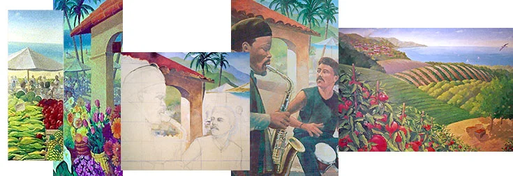
- A 10' X 16' original mural painting of a serene landscape for the Entrance Waiting Hall
- A 10' X 27' original dramatic Dining Hall Mural painting works with interior elements to wrap onto an adjacent wall
- Soothing, entertaining and transforming with encouragement, hope and discovery
BRIEF: Murals are dramatic large scale paintings that inspire through scale, story telling and style. We conceive creative concepts that take advantage of unique interior features and transform our client's messaging beyond their expectations.
PLAN: The Director of Nutrition wanted to her patients to feel respected, esteemed and validated. She wanted to encourage her patients to eat healthy.
PROCESS: Through our Creative Discovery process we learned that the patients would be lined up, waiting to enter the Dining Hall. Hungry and perhaps impatient, we felt that this audience would be embraced with a soothing and captivating environment which a mural can achieve.
Three artists were presented to the client. After the client accepted one bid, three themes were presented in pencil drawings. Pieces of several comprehensives were selected. The artist combined the elements into one pencil drawing. The pencil drawing was then translated with color. The color comprehensive was presented to our client. After minor adjustments were made, the artist began translating the artwork to a large canvas in the artist's studio. Progress photos were presented to the client in stages and the clients input was incorporated when necessary. After months of painting the originals were delivered to the site and installed by professionals. A protective finish was applied to the walls, the back surface of the canvas, and the front surface of the painting.
OUTCOME: To embrace the patient we suggested a theme of serenity in the waiting hall and at the same time tying together a theme that would continue in the Dining Hall.
Two murals were created. A 10' X 16' original painting of a serene landscape for the Waiting Hall that would represent a scenic of the greater environment outside of where the Dining Hall is located, a pastoral setting with birds flying freely while fresh food grew up close on the rolling hills. Vivid, rich mid value hues were used in the foreground depicting freshly growing food with serene ocean tones extending out to the vast horizon line. A 10' X 27' original dramatic painting works with interior elements and wraps to the adjacent wall. Here the Veterans eat their meal. The look and feel carries forward the larger environment outside the immediate location. Spanish tile roof s were depicted to tie in the immediate area. Cultural diversity and inclusiveness is represented by musicians in an open air farmers market. Soothing, entertaining, transforming our clients message beyond their expectations. Fresh fruit and vegetables, fresh flowers waiting to be purchased surround the diners with encouragement, hope and discovery.
Art at a Cancer Research Lab, Marina del Rey, CA
- Lab, Management and Executive Offices
- Original art created impact in the reception area and focal area stairwell leading to the executive suite
- Managers were assisted in the selection of art for Private Offices so that the images were consistent with the company's message yet allowed each individuals to feel acknowledged, refreshed and inspired
- Less expensive art made the Lab Corridors friendly and appealing
- 80,000 Square Feet
BRIEF: The lab is on the ground floor at approximately 40,000 square feet. Management and Executive Offices are on the top floor equal to the first floor at 40,000 square feet.
PLAN: Laboratory areas consist of many of corridors. The corridors need to be made friendly. We recommend the use of poster art on the first floor and step up the quality of art on the 2nd floor.
PROCESS: Our design services included the careful selection of art mediums to positively delineate the way different areas of the building are used, making sure that the scale and selection of the art was appropriate for each location, achieving a flow from one type of imagery to another and located so that the artwork would get the most impact.
ARTWORK:
- Private Offices: FAM worked with the managers in the selection of art for their offices so that the images that were selected were consistent with the company's message yet allowed the individuals to feel acknowledged, refreshed and inspired.
- Reception and Focal Areas: Original art created impact in the reception area and focal area stairwell leading to the executive suite.
- Matting and framing was selected to complement the art and unify the space.
OUTCOME:
- The artwork in the reception and focal areas set a welcoming tone and added to the designed interior.
- The sterile corridors were transformed with beautifully framed art that transcends the joy of art into the technicians' and visitors' lives.
- FAM's design and professional project management services met the objectives and created an exciting unified whole.

